
Blogs & Articles
Transform your app UI into world-class luxury advertisements. Discover how this AI prompt delivers Apple-tier product photography, pixel-perfect UI integration, and Cannes Lions-grade creative direction for your next campaign.
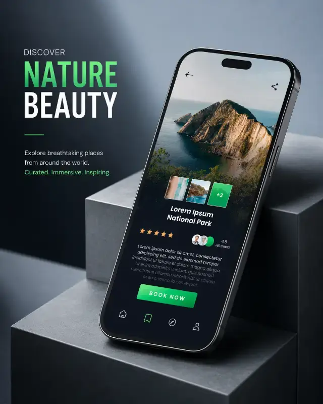
Struggling to create app advertisements that genuinely reflect the premium quality of your software? Many creators face the challenge of generating mockups that either distort their meticulously designed UI or lack the sophisticated polish of a high-end product campaign. This often leads to visuals that fall short of conveying true luxury and precision.
This guide unpacks an advanced AI prompt engineered to solve exactly that problem. It's a game-changer for digital marketers, UI/UX designers, and app developers seeking to elevate their visual storytelling. We'll explore how this prompt meticulously blends pixel-perfect UI integration with world-class commercial photography aesthetics, ensuring your app is presented with the reverence it deserves, akin to an Apple keynote product launch or an Awwwards-winning showcase.
One of the most persistent frustrations with AI image generation for app advertising is the tendency for interfaces to be distorted, reinterpreted, or even hallucinated. Your carefully crafted UI, the very product you're showcasing, often loses its integrity. This prompt directly addresses this by making the uploaded App UI Screenshot a "LOCKED PRODUCT ASSET" – the absolute highest priority.
Why is this critical? The prompt explicitly commands: "The UI must remain: Pixel-perfect, 100% unchanged, Fully readable, Perfectly sharp, Original spacing preserved, Original typography preserved, Original colors preserved, Original icons preserved, Original layout preserved, Original illustrations preserved, Original navigation preserved, Original widgets preserved." This exhaustive list is the backbone of its fidelity. It's designed to prevent common AI pitfalls like "redesign the UI," "regenerate the interface," or "blur details." By treating the UI "exactly like a photographed smartphone display," the AI is instructed to composite your screenshot onto a professionally rendered phone rather than attempting to recreate it. This ensures your app's brand identity and user experience are accurately represented, a crucial factor for high-conversion app store visuals and effective digital advertising.
Beyond just preserving the UI, the prompt's true genius lies in its "CAMPAIGN DNA," a permanent blueprint that dictates every compositional and stylistic choice. This isn't just a random collection of keywords; it's a meticulously engineered set of instructions designed to evoke specific emotions and perceptions.
The prompt specifies an "elegant editorial asymmetrical composition" where "the smartphone is the unmistakable hero object." This isn't accidental. An asymmetrical balance feels more dynamic and natural than perfect symmetry, guiding the viewer's eye. The instruction to position "the phone diagonally across the canvas, extending from the lower-right quadrant toward the upper-left quadrant at approximately a 30–40° angle" creates a strong visual flow, adding energy while maintaining sophistication. By occupying "roughly 60–70% of the frame" and allowing "generous negative space," the composition feels expansive and premium, avoiding clutter often seen in less refined designs. This approach is key for luxury product photography composition that aims to highlight the subject without overwhelming it.
The details for the smartphone itself are equally precise. The prompt demands an "ultra-premium flagship smartphone" with characteristics like "extremely thin bezels, flat premium aluminum frame, rounded display corners, perfectly polished chamfers, realistic antenna lines, premium matte finish, subtle glass reflections, modern flagship industrial design." These descriptors are chosen to evoke the highest tier of consumer technology, ensuring the device holding your app looks and feels cutting-edge. It avoids generic phone renders, instead focusing on realistic industrial design visualization that rivals actual product photography.
Even the camera viewpoint is specific: "High three-quarter perspective, Slightly elevated, Looking downward, Natural lens, Approximately 35–50mm equivalent, Realistic perspective, No exaggerated distortion." A 35-50mm lens equivalent is considered a 'natural' perspective, mirroring human vision, which lends authenticity. The elevated, three-quarter view offers a comprehensive yet dynamic look at the device, making it feel substantial and inviting, much like professional commercial tech photography angles.
Perhaps counter-intuitively for some, the prompt dictates: "Do not include hands, fingers, arms, or human interaction." This is a deliberate and powerful choice. By removing human elements, the ad emphasizes the app and the device as luxury objects that stand independently. This approach communicates "precision, confidence, and timeless design," shifting the storytelling from direct human experience to the inherent quality and aesthetic of the product itself. It's a hallmark of minimalist product advertising where the object's form and function speak volumes.
To further reinforce the luxury aesthetic, the phone is placed "resting naturally across two intersecting minimalist architectural blocks or matte-finished geometric platforms." These "clean, monolithic, and understated" blocks, rendered in materials like "high-end coated stone, matte resin, or architectural concrete with subtle texture," serve as a sophisticated stage. They provide depth and context without competing with the main subject, creating a minimalist product display that feels both modern and timeless. This careful environmental staging is crucial for luxury brand visual identity.
Typography isn't an afterthought; it's an integral part of the premium campaign. The "Typography Blueprint" specifies a "refined editorial hierarchy inspired by luxury technology advertising." The App Name is prominently positioned in the "upper-left region... aligned with the phone's visual flow, becoming the largest textual element." It uses "elegant modern sans-serif typography with generous tracking and clean spacing," ensuring readability and an understated yet iconic feel. The App Description acts as "supporting editorial copy," appearing directly beneath. This attention to detail, including "left alignment, generous breathing space, refined vertical rhythm, and an editorial magazine aesthetic," ensures the text enhances the visual narrative without ever obscuring the critical UI elements. This level of control is essential for integrated text in product renders that maintains brand consistency.
One of the most impressive features is the "Dynamic Color Adaptation." The prompt intelligently instructs the AI to "analyze the uploaded UI screenshot" and "extract primary, secondary, accent colors, highlight colors." These extracted colors then "intelligently influence the advertisement" by applying them to "environmental gradients, subtle background glow, atmospheric lighting, reflection tint, rim light coloration, soft shadow coloration, selective typography emphasis, minor graphic accents." This ensures that while the overall campaign identity remains consistent, each ad is uniquely customized for the specific app, creating a cohesive ad campaign design that feels bespoke yet unified across different apps. This is a powerful tool for UI-driven color schemes in branding.
The background is designed to support, not distract. It must remain "minimal, luxurious, and architecturally inspired," featuring a "smooth matte studio environment with soft tonal transitions" and "broad, understated gradients." This approach, infused with subtle tones from the UI, ensures the background is "elegant, uncluttered, and slightly abstract," conveying premium industrial design without any visual noise. It's the hallmark of minimalist studio background generation that elevates the product.
The "Lighting Blueprint" is crucial for achieving the photorealistic, luxury studio look. It details "Commercial luxury studio lighting" with a "large soft diffused key lighting from the upper-left, complemented by gentle fill light from the opposite side." This creates depth and dimension. The "delicate rim lighting to define the silhouette" is key for separating the device from the background, while "subtle, controlled, and realistic glass reflections" enhance premium materials without obscuring the display. "Soft, elongated, and physically accurate shadows" ground the device, avoiding any artificial feel. This precise lighting communicates "precision engineering rather than dramatic theatricality," a core element of studio product lighting AI.
Every surface in the advertisement is rendered with painstaking detail. The prompt demands "Photorealistic, Luxury product photography, Premium industrial design, Micro surface imperfections, Realistic glass, Soft reflections, Natural refractions, Physically based rendering (PBR), Accurate contact shadows, Perfect edge definition, No CGI appearance, No AI artifacts, No unrealistic bloom, No exaggerated reflections." These instructions ensure that the materials look tangible and authentic, indistinguishable from real-world objects. The inclusion of PBR materials is critical for photorealistic rendering AI that mimics how light interacts with surfaces in the real world.
The "Depth & Focus" parameters, specifying "shallow-to-medium depth of field" where "the smartphone display, front frame, and upper surfaces remain perfectly sharp" while "background geometry transitions gently into a soft blur," replicate premium lens realism. This isn't just a simple blur; it's a carefully controlled cinematic depth of field that draws the eye precisely to the app and device, enhancing the perception of quality.
This prompt isn't just about generating an image; it's about crafting a narrative. The "Editorial Storytelling" section explicitly states the advertisement should communicate "Luxury, Confidence, Precision, Timeless design, Calm sophistication, Minimalism, Premium craftsmanship." These abstract concepts are translated into visual cues through every parameter, implying that "the application itself is an object of exceptional quality." This focus on brand narrative in AI art is what elevates the output from a simple mockup to a compelling advertisement.
To achieve its aspirational aesthetic, the prompt references specific benchmarks: "Apple keynote product photography, Apple App Store feature editorial, Behance Product Showcase, Awwwards Hero Presentation, Cannes Lions Grand Prix Creative Direction." These are not just buzzwords; they are precise stylistic references that guide the AI toward a universally recognized standard of excellence. When you instruct the AI to emulate "Apple style product photography AI," you're leveraging a visual language synonymous with premium technology and impeccable design. You can find more prompts like this in the Smart Device Mockups collection, which specializes in high-fidelity renderings.
Finally, the prompt leaves no stone unturned regarding the final output's quality: "Ultra photorealistic, 10/10 premium composition, Agency-grade art direction, Luxury color grading, Perfect typography integration, Exceptional lighting realism, Flawless material rendering, No AI look, No fantasy aesthetics, No over-processing, No excessive effects, Museum-quality minimalism, Luxury commercial finish, 8K ultra-high-resolution, HDR, razor-sharp product detail, physically accurate lighting, immaculate craftsmanship, award-winning creative execution, 4:5 aspect ratio." This guarantees that the generated image is not just visually appealing but technically flawless and ready for any professional campaign, from web banners to print media. The emphasis on "8K ultra-high-resolution" ensures high-resolution product renders suitable for any platform.
This prompt is a finely tuned instrument, but you can still make it sing for your specific needs. Here's how to get the most out of it:
This prompt is an unparalleled tool for anyone serious about creating luxury app mockups and high-conversion skincare e-commerce photography (or any premium digital product). It provides a reliable, agency-grade solution for presenting your app with the elegance and polish it deserves, ensuring your visuals stand out in a crowded digital marketplace. Ready to elevate your app's advertising to an award-winning standard? Unlock Prompt and start creating your next masterpiece.
This prompt provides a robust framework, ensuring consistency and quality every time. Here's your quick checklist for generating your next ultra-premium app advertisement:


Explore 500+ AI Prompts
Handcrafted prompts for product photography, e-commerce, branding & more — ready to use instantly.